
OCVIBE
Branded Placemaking for the Curious Class
Experiential Branding
2023-2025
LEARN MORE
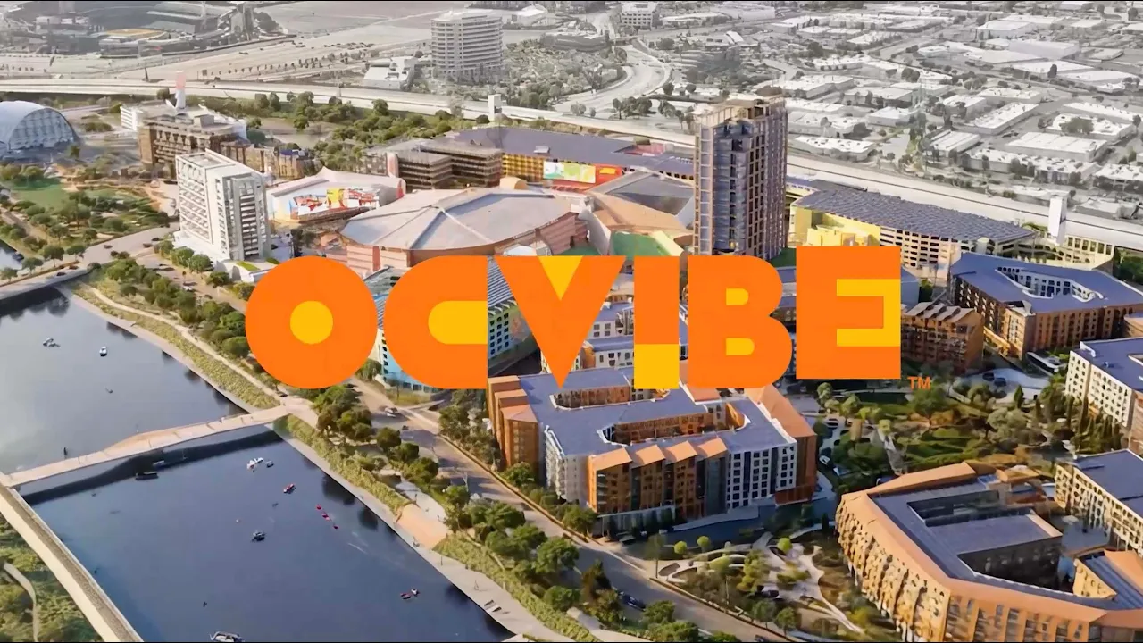
— OCVIBE is a $5 billion, 100-acre sports and entertainment district designed to be the epicenter of everyday inspiration in Orange County. I served as the central creative stakeholder, leading the development of the brand and experiential content strategy for an incredibly complex house of brands steeped in technology.
BRAND EXPRESSION
RESPONSIBILITIES
BRAND LEADERSHIP, CREATIVE DIRECTION, CONTENT STRATEGY, PLACEMAKING, BUSINESS DEVELOPMENT

The word "Epicenter" became a way of seeing, giving the visual system a single strategic point of origin to help others understand the brand's personality. Every decision, from stylization to motion to layout, is traced back to this vision. The result was a brand that didn’t rely on decoration to feel expressive, but on strategy to give every visual moment purpose.

Reverberation and reveals became core visual treatments that I wove through the design system to mirror how the district behaves in real life—crowds cheering, music pulsing, moments colliding. Not only did these open the door for exploration, it gave traditional marketing a sense of movement that easily translated to animation.


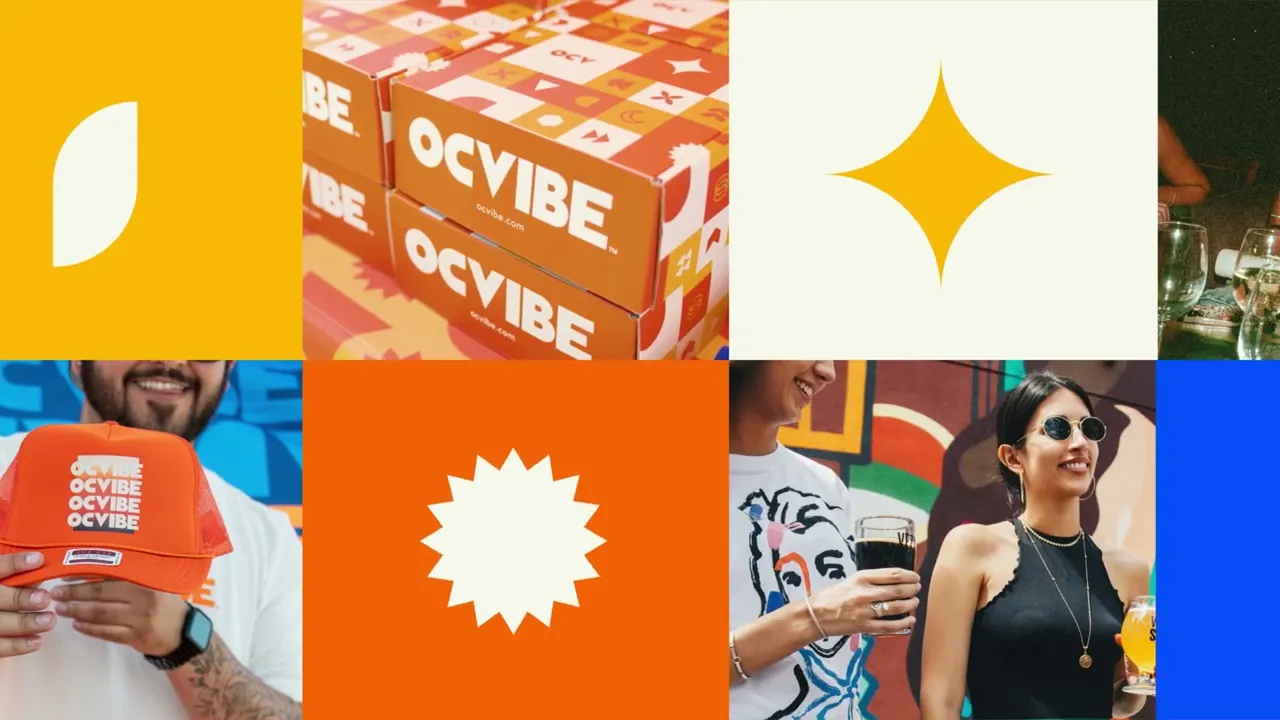
The system needed to feel future-forward without sacrificing longevity, and expressive without becoming too stylistic. Right Grotesk by Pangram offered that balance with 99 styles ranging from ultra-condensed to ultra-wide, it gave the brand enormous range while preserving consistency, enabling layouts and motion to flex endlessly while remaining unmistakably cohesive.
We used color as a strategic tool to create a system that worked forwards or backwards and allowed for endless variation. Two primary palettes transitioned seamlessly from oranges to blues with the time of day or messaging, while each secondary color was paired with an analogous partner to differentiate where you were in the district at any given time.


The shape language became the brand’s expressive engine. Brutalist in spirit—with bold geometry, thick strokes, sharp angles, and moments of softness—the system moved fluidly between 2D and 3D. Whether static or in motion, these forms reinforced a single idea: OCVIBE is a place with many layers, where exploration is rewarded and no two encounters are the same.

Patterns lived on a spectrum from simple to expressive. Anchored by an underlying grid and built from the shape library, they scaled effortlessly across formats and colorways—often appearing as transitions that rippled through the brand, revealing new moments of discovery along the way.


Built on a strict grid and a tightly defined style system, icons borrowed cues from the shape language to ensure cohesion across the visual system. In motion, abstract shape overlays activated each icon. The set balanced instant recognition with a quiet sophistication, shaped by the same visual DNA as the rest of the brand.

From the start, the brand was built to move. Animations carried the energy of the district, shifting and flowing across digital walls, screens, and interactive surfaces. Each choice reinforced the narrative of discovery: fluid transitions, subtle gestures that spark curiosity, and prismatic movements that let viewers see in new ways.
My vision was to blend 2D and 3D to create a brand strong enough to hold its shape but fluid enough to reflect whoever's looking. The refractive glass treatments transform the logo into an optical experience—depth, transparency, and refraction invite you to look closer. This transmorphic approach created a constraint-based framework for future personalization.


IN SHORT
Building this brand involved more than a good design system. It was as much an education task as a design task to help everyone become a visionary brand steward.
Content Strategy

The Challenge
RESPONSIBILITIES
Overarching Vision, Strategy, Technical Oversight, Vendor Management, Business Planning

Nothing beats a good rallying cry to get everyone excited about a vision.
Success hinged on a simple truth: our audience would come to satisfy curiosity. The goal wasn't capturing attention—it was delivering delight that made them return week after week, transforming visitors into advocates. Each return visit had to deepen and drive brand loyalty, but you can't program loyalty without clarity. I started with a framework to guide what content to create, why it belonged, and how to scale strategically.


That framework began with understanding delight, but delight isn’t singular. It shifts with context. People process content differently depending on where they encounter it—a menu board solves a need, while an immersive tunnel invites wonder. I centered the strategy around how people process delight—behaviorally, viscerally or reflectively to help guide what content belonged where.

Understanding how mindsets change as people move throughout a space is critical to programming effective content.
The challenge wasn't just what to program—it was establishing what actually drove engagement versus filled time. I built a system connecting engagement type to content type to screen, codifying why certain content belonged where and how visitor intent shifted by location. This let teams program independently with confidence rather than being order-takers.


Screens weren't categorized by size or location, but by visitor mindset when encountered. Passive surfaces planted curiosity during transit. Active surfaces held attention through spectacle, with content designed for impact rather than interruption. Interactive surfaces transformed visitors into participants using motion-reactivity and gamification to deliver delight.
Five main content typologies became our foundation—from basic ads to complicated district takeovers. This à la carte approach ensured everyone could participate: local artists shared space with household names, budgets flexed from modest to premium. These categories didn't limit creativity—they clarified what to sell and how to budget for any ambition level.


The Urban Park was one of two zones with unique content needs, with this area being the peaceful place to grab a nice meal before the concert.
Translating strategy into creative direction required matching content to context. With two zones serving vastly different purposes—one peaceful, one electrifying—we needed platforms to guide curation. Mesmerism for the Urban Park delivered layered hypnotic experiences rewarding curiosity. Amplification for the South Plaza unleashed bold, dynamic visuals that transformed game nights into electric momentum.


Matching content to context meant considering time, not just place. Using sound wave patterns as a guide, I mapped out a daily tempo—gentle oscillations in the morning building to energetic peaks by evening. This prevented jarring mismatches, ensuring early visitors encountered serene atmospheric content while nighttime crowds experienced the bold, celebratory energy they came for.
Strategy doesn't exist in a vacuum—it has to also account for technical reality. I worked alongside our creative technologist to ensure every framework considered hardware constraints: LiDAR motion tracking for interactive moments, spatial audio for zoned experiences, or how content shifted from LED to X-Glass . This wasn't just creative vision—it was operational rigor grounded in feasibility.


Content in the South Plaza needed to match the energy emanating from the Honda Center, offering a unique experience a short distance away.
All the frameworks led to one critical question: would it work financially? Working with cross-functional partners, the strategy enabled modeling that projected tens of millions in revenue potential over five years, with profitability by Year 2. For a team that had never programmed experiential content, this proved the strategy wasn't just creatively ambitious—it was commercially viable at scale.


The turning point came with a direct question from the CEO: how do you measure elevated emotional experiences? The answer was a model that didn’t replace impressions, but built on them. By identifying five quantifiable pillars of emotional value—memory, quality, association, differentiation, and amplification—we created a practical way to assign real value to creativity without flattening it into vanity metrics.
The framework quickly became the foundation for every vendor engagement. Partners like Moment Factory and Disguise responded to the clarity immediately, using the strategy to scope accurately, model feasibility, and build precise proposals. It set a new bar—proving the rigor was not only rare, but essential.


The first set of surfaces to came online seamlessly launched on time using the models and creative specs to publish live content quickly.
IN CONCLUSION
“‘I didn’t get it before. Now I do.’ is a testament to how this work stream became a complete business plan. The work finally made sense—and inside the organization, it became known as ‘The Jenny Deck.’”
Campaigns

The Honda Center’s 30th Anniversary marked one of the first real expressions in the lead up to launching the OCVIBE brand. Inspired by SoCal's collision of mountains, beaches, and sport, the design centered on radiating lines swirling around an epicenter. From packaging to an ice luge, I led the team across a wide range of deliverables, culminating in a sold-out Gwen Stefani concert. A limited-edition illustrated poster became an unexpected cultural hit, reselling on eBay within days.


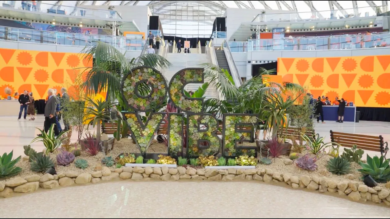
The OCVIBE Brand Launch marked the first full expression of a brand we had spent a year building. This two-day event transformed the ARTIC train station into a miniature OCVIBE—activating multiple floors with experiences previewing the district’s future. Two 100-foot LED screens debuted our new motion system, while a limited-edition poster—presented to the Mayor of Anaheim—marked the moment. Nearly 1,000 guests, from civic leaders to the NHL team, moved through a fully realized brand in action.


Digital Design

RESPONSIBILITIES
CREATIVE DIRECTION, DIGITAL DESIGN, VENDOR MANAGEMENT
This project placed me in a rare position: leading digital vision from the client side with an agency partner. Having spent most of my career on the agency side, I had to bridge high creative ambitions with practical business goals to deliver a future-forward approach that changed colors based on time of day and heavily emphasized the importance of effective content pacing.
From the start, the website was built to meet the moment. I pushed for rigorous systems—modular components, disciplined interaction patterns, and strong structural foundations—so the brand could move at the speed of culture. This approach allowed the site to stay expressive, current, and adaptable as trends shifted and expectations evolved.
Color and interaction became narrative tools. Transitions weren’t decorative—they guided attention, revealed hierarchy, and reinforced mood. Every hover, scroll, and reveal was an opportunity to echo the energy of the district, turning navigation into a subtle act of discovery rather than a purely functional task.

The app became a space to champion user experience when it wasn’t yet instinctive internally as well as an opportunity to nurture the growth of my design team. We pushed deep and conceptualized how this app balanced UX clarity with everything the district demanded of it—along the way scaling the brand expression.

Each surface in the district had its own purpose, but all shared a common experience goal of making OCVIBE feel seamless to visitors.The app was part of a larger ecosystem, and it was my responsibility to ensure that the app was considered in the larger content strategy goals, as well as how it interacted with the brand in the built environment.

EXPERIENTIAL

RESPONSIBILITIES
CREATIVE DIRECTION, DIGITAL DESIGN

The AR Experience gave the public their first glimpse into the district while it was still under construction. Launched in conjunction with the brand coming online, and accessible via a QR code, the app used 360-degree living renders to let visitors explore key zones within the district. Users could move through space and tap hotspots to discover what was coming—giving the brand instant credibility and becoming a hit with sales and marketing teams.


Leading design end-to-end, I worked with our architectural partner to create an experience that maximized impact within limited time and investment. Color became the organizing principle: primary brand colors marked areas opening soon, secondary colors signaled future phases. A dual navigation system let users jump between zones quickly while swiping through hotspots within each area—creating intuitive exploration of a district that didn't yet exist.
The Draft Picks Tap Room gave agency to the thirsty sports fan. Personalized QR-coded cups let visitors pour their own beer with automated precision—perfect foam, no wait staff, no lines. Two ultra-wide screens above the taps educated users and displayed rotating beer options, while content was designed to be flexible for an everchanging rotation of beers and kegs.
Sports arenas present unique constraints—overwhelming noise, dense crowds, constant motion. The two-screen system solved for this with an upper screen acting as a beacon and the lower screen as guide. A key learning was that some fans were instant adopters, while others hesitated to watch the instructional videos before gaining confidence to pour their own beer.


RESULTS
The Draft Picks Experience became an instant hit with fans earning double the expected nightly profits. Following this launch, a second location was launched for the 2025 NHL season.
Summary


