
14 Jan City of Santa Ana
Posted at 01:01h
in Uncategorized
City of
Santa Ana.
Introduction
Just south of Los Angeles is the culturally rich city of Santa Ana. As the federal seat of Orange County and a major thoroughfare of southern California, the population density of this historic town expands and contracts wildly each day. The challenge was to create an all-encompassing active transportation campaign that reached the contrasting audiences and improved road safety.
Scope of Work
• Historical Strategy Research
• Ethnographic Research
• Public Survey Development
• Campaign Platform Discovery
• Campaign Messaging
• Design Research
• Creative Concept Presentation
• Illustration & Design
Background
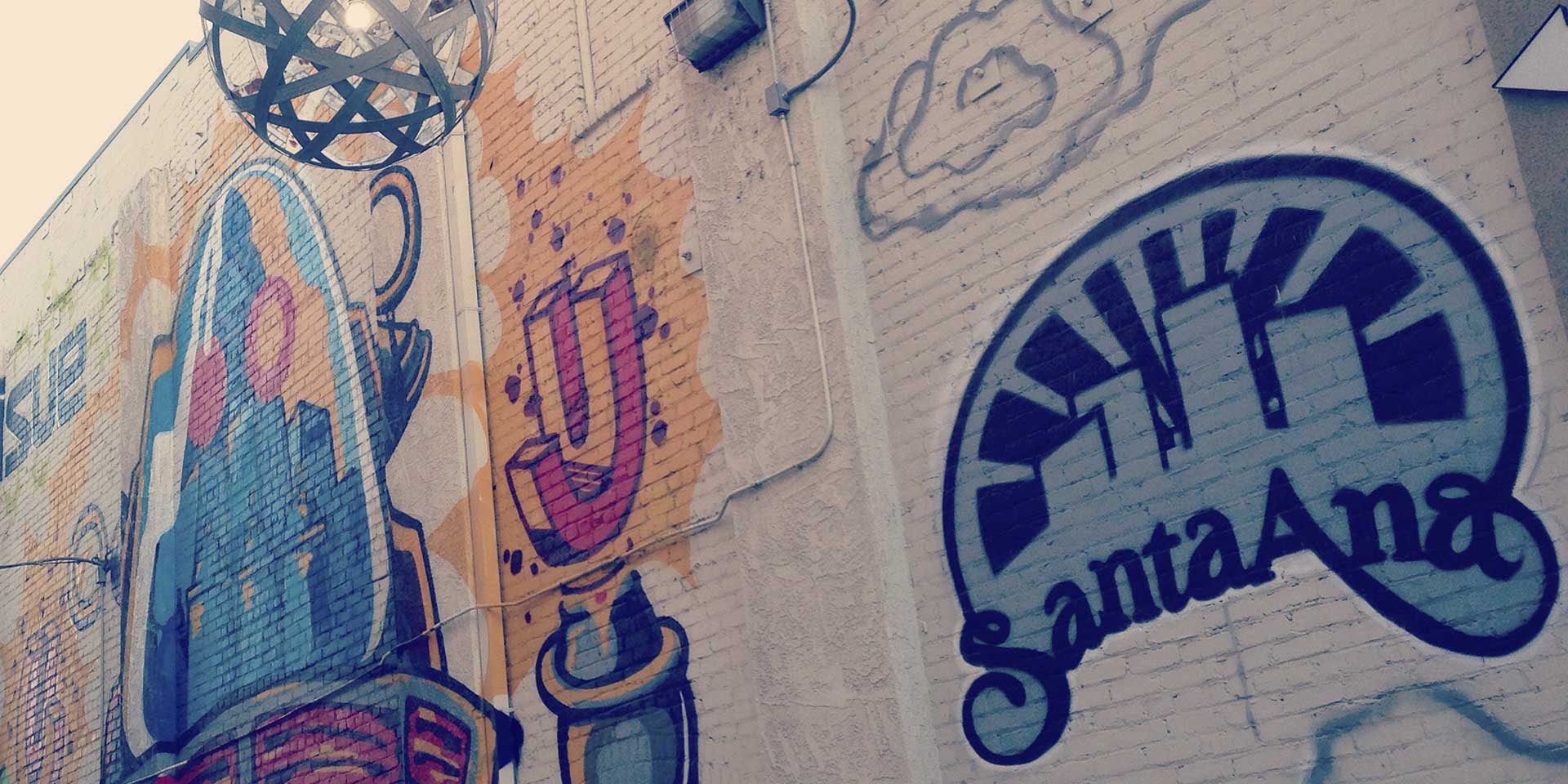
As a historical backbone in Southern California, Santa Ana is now the fourth-densest city of its size in America. A vast majority of the population today is comprised of young community-minded Hispanic families. City leaders are working to improve awareness and teach bicycle safety as part of their overarching goal of improving infrastructure.
Collaboration
Partnering with fellow SVA Masters in Branding alumna Gena Cuba and well-known transportation planning agency Alta Planning + Design, we strove to listen and learn from the people of Santa Ana. Our approach the problem was through the lens of equality and awareness. But first we had to understand what roadblocks stood in our way.
Research.
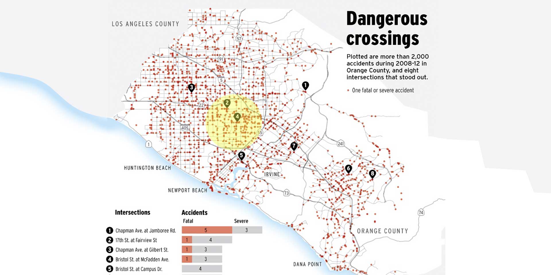
Key Challenges
1: Bicyclists riding opposite of traffic flow
2: Driving or bicycling while intoxicated
3: Riding bicycles on sidewalks
4: Drivers passing bicyclists too closely
5: A large influx of commuters from surrounding communities
To discover where and how we could address bicycling safety within Santa Ana and leave a lasting impression began with public surveys and stakeholder interviews. Though this process we tested our approach and learned that a message of unity had worked in the past and could work again. Our scope shifted to build a campaign that could unify all of Santa Ana’s safety initiatives under one roof and promote courtesy as a community value.
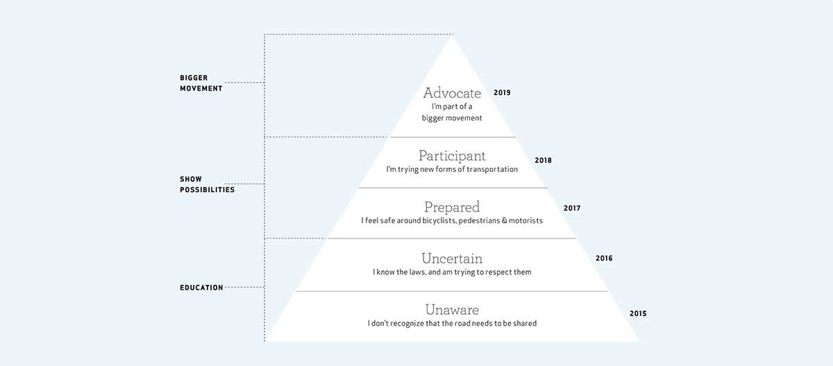
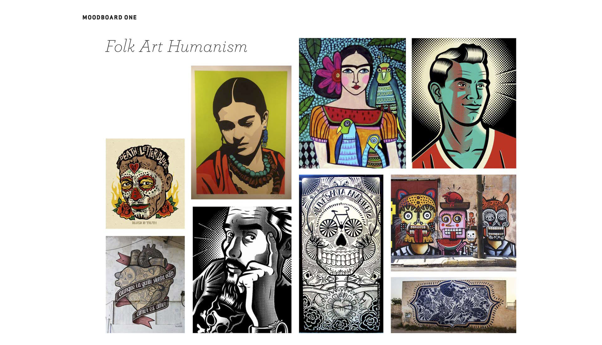
Cultural Research
We kicked off this phase with a full week of cycling and commuting around Santa Ana to get a feel for the infrastructure, behavior of motorists, and all-around safety of the city. We spoke to key influencers in Santa Ana who were actively working to change their city, as well as transportation advocates in Los Angeles and Santa Monica who have taken on similar efforts. Concurrently we released a survey through the city and schools to poll how people felt about transportation in Santa Ana.
What We Learned
Experiencing the city’s vibrant arts culture within their historic downtown was profoundly inspirational. Citizens protect their culture fiercely but sit economically lower than surrounding communities with typical cyclists biking because they have to in order to get to work or school. Pedestrian traffic is much higher than surrounding regions as families walk children to school. While the majority of car traffic is a vast commuter population commuting to the city’s federal and technological hubs.
Strategy.
Platforms
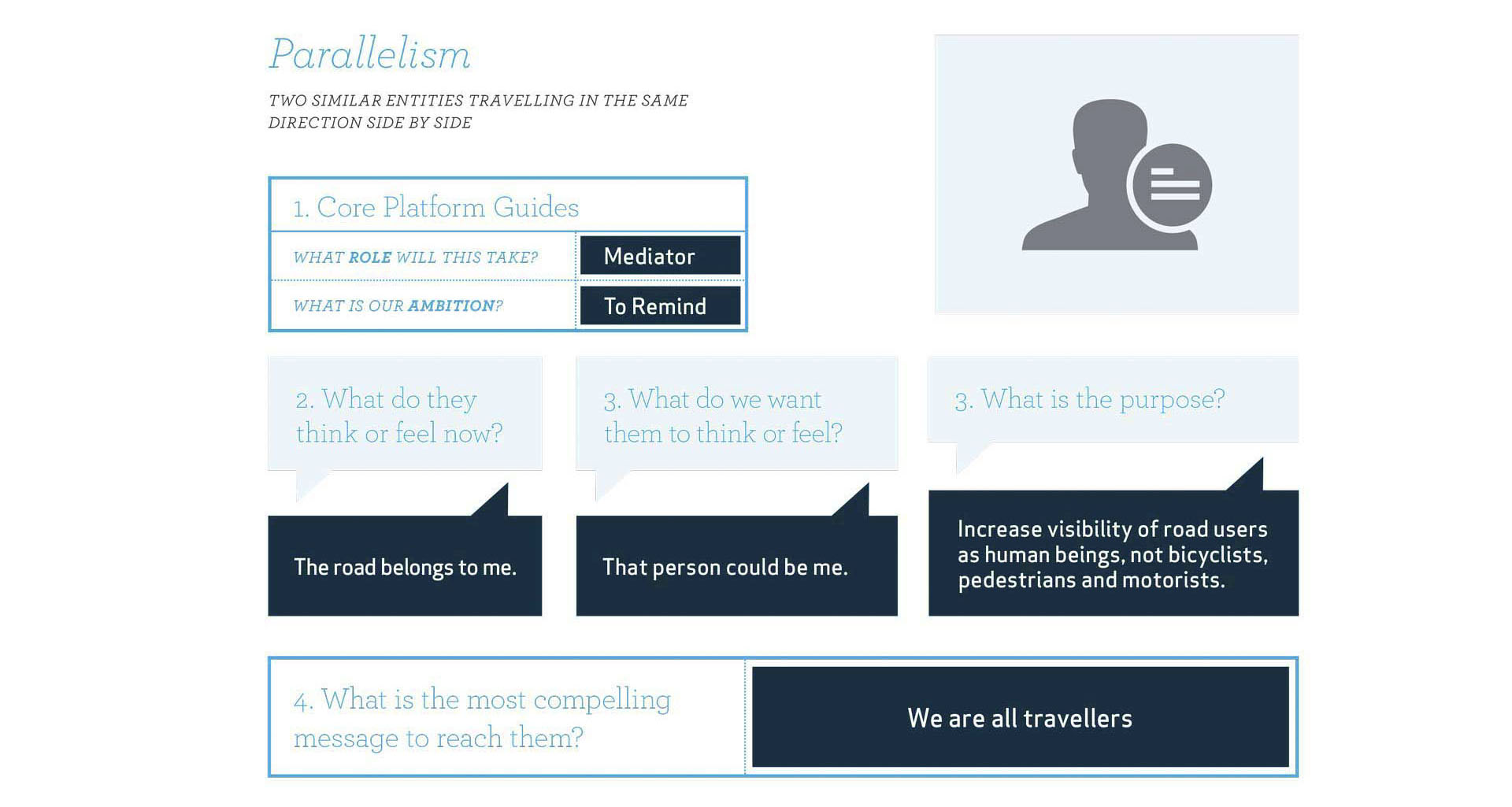
It was clear from our research that a direction heavy on prescribing language or alarming imagery would fail. Instead, we headed towards a more harmonious and inclusive direction that did not celebrate nor alienate yet yielded an important realization. We presented three platforms: Juxtaposition, Parallelism, and Witticism. Parallelism won, and we began creative that reminded everyone that we are all travelers heading in similar direction side by side.
Creative Concept
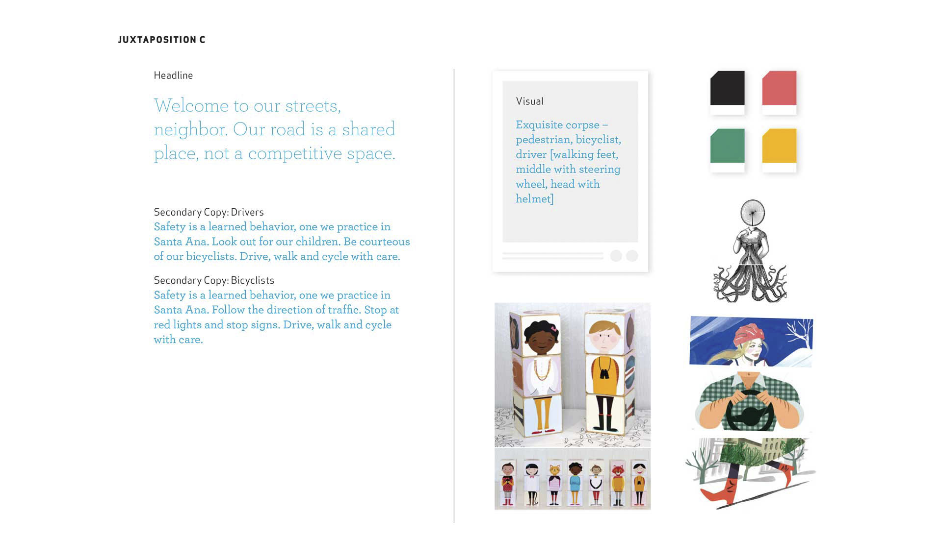
Each platform was presented with a broad visual concept, language inspiration, and a mood board to ground the concepts in reality. As with all clients, they mixed and matched concepts from each platform. What caught their eye the most was an idea based on the party game “exquisite corpse,” featuring an illustrated character comprised of different people. Our character would be a cyclist, a driver, and a pedestrian sharing the space side by side.
Design.
Messaging
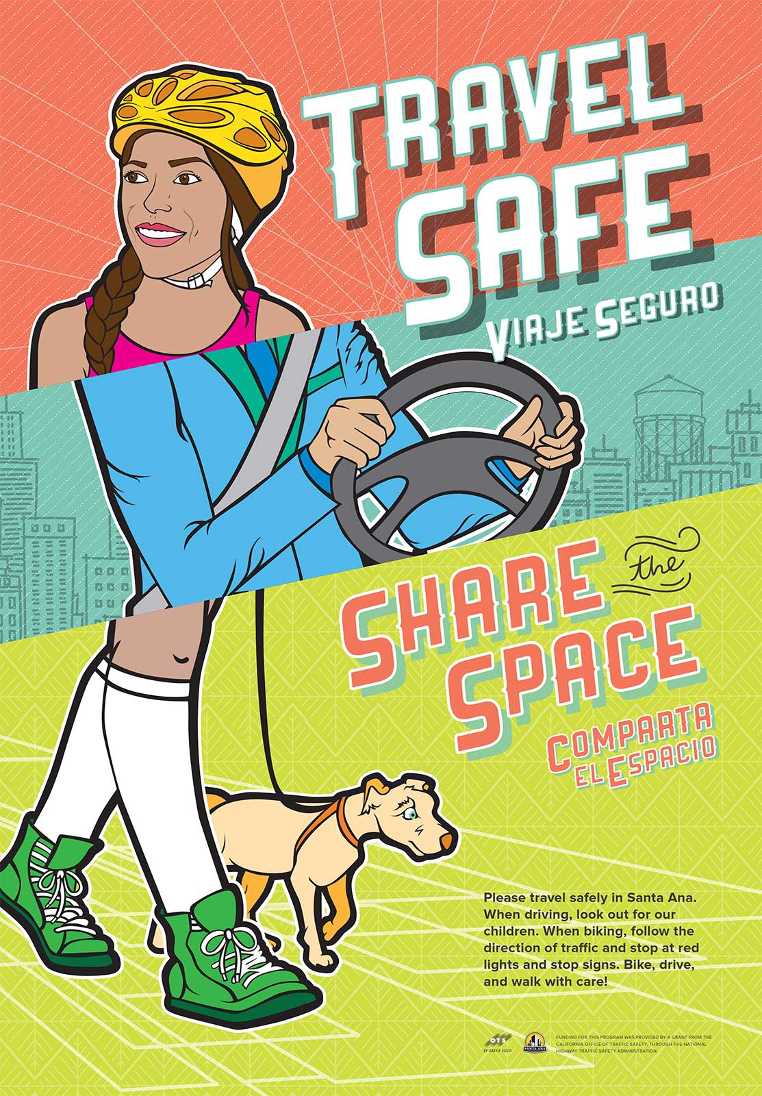
A requirement from the getgo was that our final execution had to be bilingual and work emotionally between English and Spanish. To get started we brainstormed and inspired each other with words and segments of phrases that mapped back to all of our research and strategic direction. What came of those sessions was put in front of a translation team and finally we landed on “Travel Safe Share the Space” and “Viaje Seguro Comparta el Espacio.”
Visual Execution
Two observations from our stakeholder interviews inspired our campaign concept, those were that the Hispanic population and women felt grossly under-represented in PSA transportation campaigns. In particular, generations of women in the local culture were never encouraged to ride bicycles despite being key community influencers and frequent pedestrians. We wanted Santa Ana to have a campaign that represented and reflected their future community.
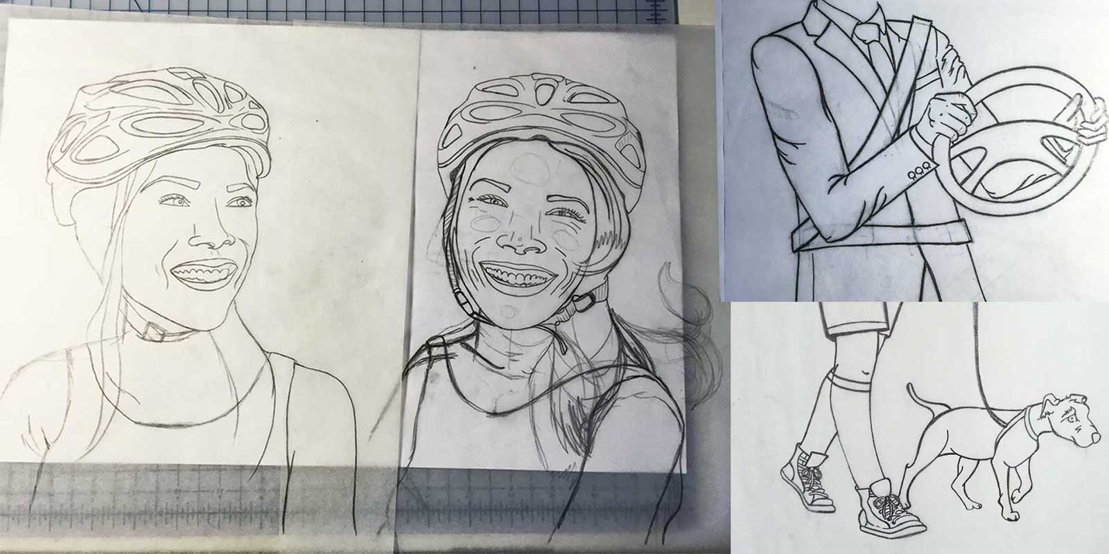
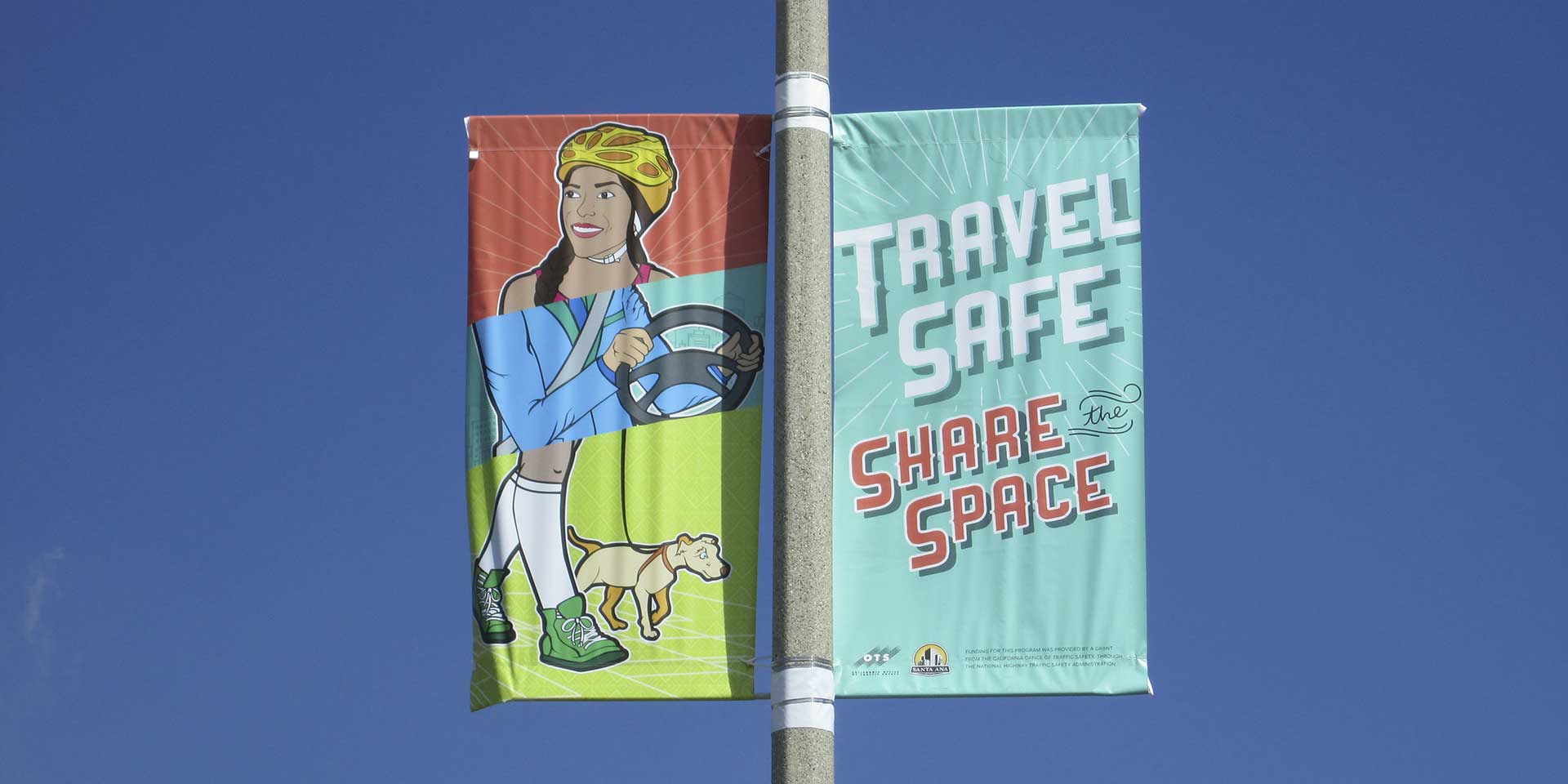
Illustration
The vibrant arts culture within Santa Ana made my job that much easier thanks to endless inspiration. This campaign artwork represents the future cyclist, the outsider driving through, and the everyday pedestrian out and about using city infrastructure. It’s about living and moving side by side heading in the same direction on the same roads in harmony. The messaging is a reminder to be courteous while the visual nudges that everyone belongs. Vibrant colors and intricate background patterns map to local cultural artwork, and the icon Santa Ana water tower even found a place.
Initial and Subsequent Relaunch
The media buy for the initial launch brought the campaign to almost 100 street pull banners and a dozen bus shelters at strategic intersections. In the following years, our client has won further grants and brought the campaign back each year, expanding its media buy each time.